

Choose Paint Colors that Boost Your Mood
What’s the secret to a happy home? It could be the paint on your walls. According to the London Image Institute, the colors we surround ourselves with can have a significant impact on our mood and overall well-being. There’s even a branch of psychology that deals specifically with the effects of color on the brain. Here’s a guide to the best mood-boosting colors:
Graceful Green
Green is associated with nature and can bring a sense of harmony, balance and relaxation to any room. Use lighter shades of green to make a space feel open and airy. Green works magic on family rooms with sliding glass doors because they create continuity between the space and lush backyard.
Beautiful Blue
Blue is an ideal color for bedrooms as it promotes feelings of relaxation and tranquility. Research has shown that just seeing the color can reduce your heart rate and respiration. Blue can also evoke a sense of freshness and cleanliness, making it a great choice for bathrooms or kitchen spaces.
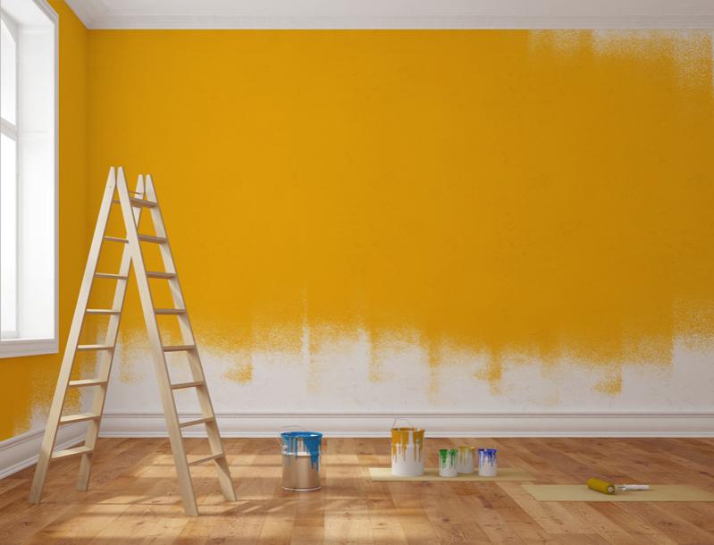
Creative Yellow
We commonly associate yellow with happiness, but the color has also been shown to increase creativity. You can use it in your kitchen to promote feelings of comfort and warmth or in home offices to promote productivity. When it comes to yellow, lighter is better as vibrant yellows can overwhelm a space.
Invigorating Red
The words “seeing red” associates that color with anger, but it couldn’t be further from the truth. Shades of red promote feelings of excitement and energy. Used in your home gym, it can make you excited to work out. Painting your entryway red can make guests feel excited to enter your home. Use it sparingly though, too much has been shown to increase anxiety in some people.
Energizing Orange
People don’t use shades of orange as much as they should. The color can bring warmth and enthusiasm to a room and seems to promote social interaction. That makes it a good color for game and media rooms. You don’t need to go bright orange. Find a shade of coral you love and pick up the paintbrush.
Focused Gray
Neutral tones such as gray help you focus without distractions. Use it in your office or workroom to encourage productivity.
Soothing Purple
Purple is the color of royalty for a reason. It is associated with luxury, especially in jewel-tone shades. Lighter shades can evoke a sense of calm and serenity. Purples work well in nurseries, bedrooms and playrooms to promote relaxation.
